

本文已经翻译成中文《通过设计让学习变轻松—Google 的 Primer 团队是如何做用户体验设计的》,欢迎参加「掘金翻译计划」,翻译优质的技术文章。
How can design make learning feel like less of a chore?
It’s not as easy as it sounds. Flat out, people usually won’t go out of their way to learn something new. Research shows that only 3% of adults in the U.S. spend time learning during their day.¹
Think about that for a second: Despite all the information available at our fingertips, and all the new technologies that emerge seemingly overnight, 97% of people won’t spend any time actively seeking out new knowledge for their own development.
That was the challenge at hand when our team at Google set out to create Primer, a new mobile app that helps people learn digital marketing concepts in 5 minutes or less.
UX was at the heart of this mission. Learning has several barriers to entry: you need to figure out what, where, how you want to learn, and then you need the time, money, and energy to follow through.
This meant our UX needed to serve double duty: The app needed to be inviting and intuitive, and it needed to overcome all the factors that keep people from learning.
To tackle that challenge, we thought about the three main places where users would spend time in our app: the dashboard, the individual lessons, and the activities within each lesson.
The dashboard is incredibly important because it’s the first thing people see when they open the app. We iterated and prototyped different dashboards for months. We had lots of ideas: lesson packs, letting users pick from three random lessons, geolocation for events related to the lesson topic, or special widgets about experts and brands we worked with. The possibilities were endless.
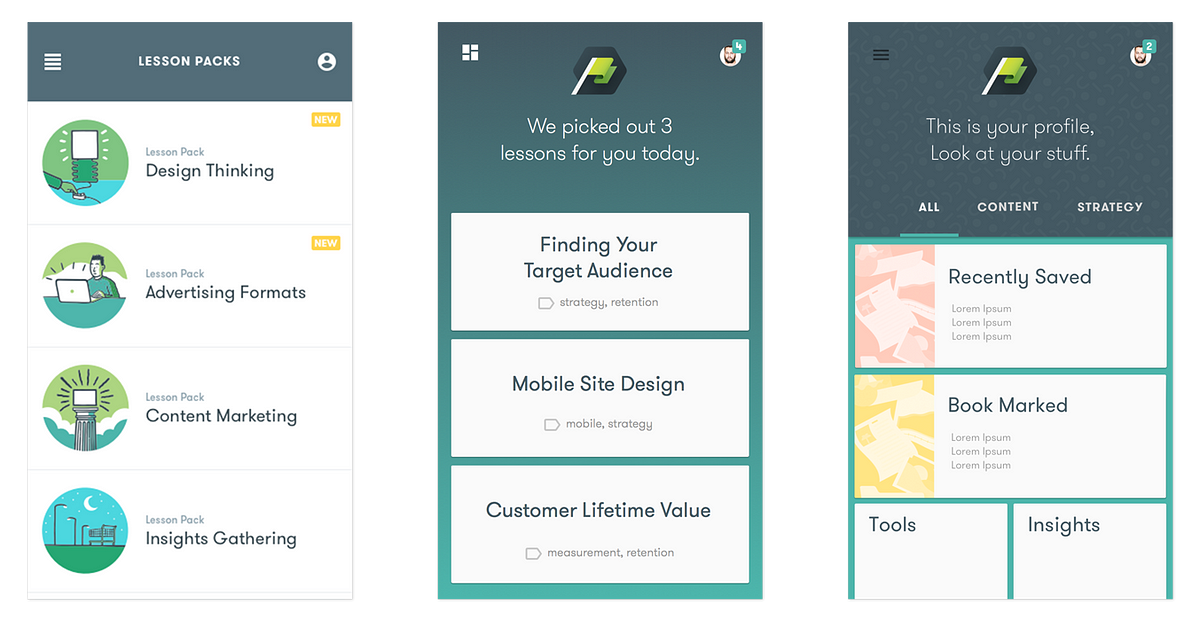
It was clear we needed a guiding principle, so we put ourselves in users’ shoes. We theorized that people coming into the app would fall into one of three camps:
- Passive: They will be looking around and browsing.
- Curious: They will be looking to learn something, but not sure what.
- Active: They will have more of an idea about what they want to learn.
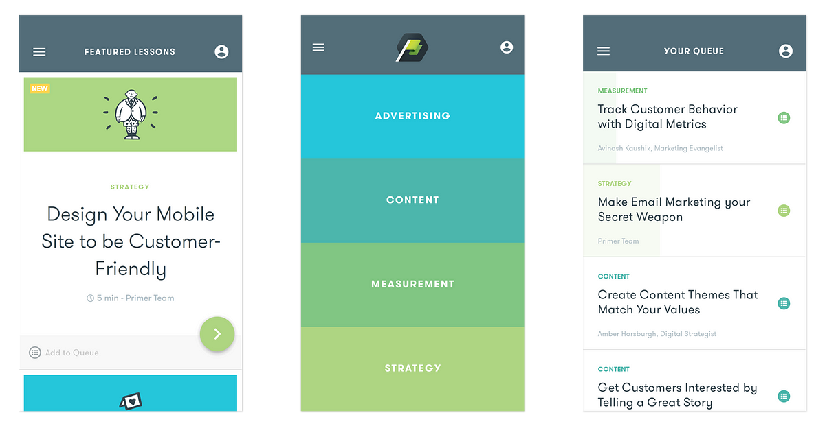
For the Passive group, we created the Featured section, which shows five suggested lessons people can do right away.
Meanwhile, we made it easy for Curious users to find lessons via topic or category: Advertising, Content, Measurement, and Strategy.
And, for Active users, we created a curation tool: the Queue. Here, they can put together their own “playlists” and easily add and remove lessons as they wish.
The next element of the app is the lessons themselves. Primer’s lessons are meant to be great time-passers; users can do them on the train or while their kids watch cartoons.
But learning requires engagement. We can’t afford to let users swipe through the content mindlessly.
We dubbed our solution “Rhythmic Learning.” Every lesson element — each swipe, each card stack, and each illustration — was designed to rhythmically guide the user through the content.

The swiping gestures give users a sense of completion with each card and stack. A text document packed with information feels daunting, but a lesson broken down into cards feels manageable. These cards are grouped in stacks of 3 to 7, and once the last card is swiped away, another stack slides into view. Finishing a stack becomes a micro-accomplishment, meaning users don’t have to wait until the end of the lesson to feel like they’ve learned something.
That’s also where the illustrations come in. Each illustration is a small moment of delight, providing a chuckle or a smile that helps bring the content to life. Incorporating an illustrator into our lesson-creation process added an extra workstream, but it also added a wonderful mix of humor and editorial-ness to the lessons.
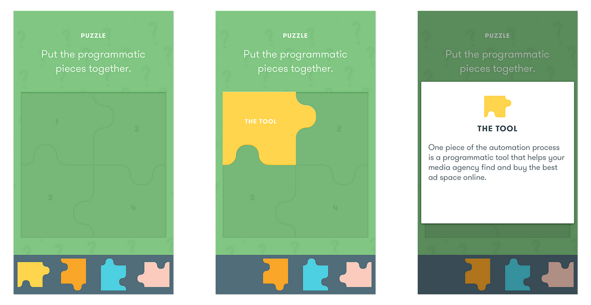
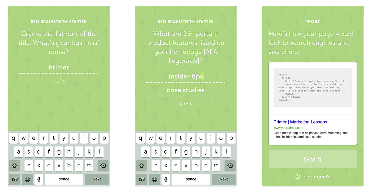
The third and final element of our UX design is the activities. We landed on three types of interactions that appear at different times: Quick Starts appear early in each lesson; Mid-Lesson Activities appear during the lesson; and Do This Nows come at the end.
The point of the Quick Starts is to get people engaged with the concept of the lesson right away. In the search advertising lesson, for example, users are asked to find a striped sock in a pile of clothing. This Where’s Waldo-style activity illustrates the value of appearing near the top of search results: Unlike a pair of socks lost among other clothing items, a search ad stands out among search results. The interaction is not a test but a way to get people thinking about the topic right away.

Mid-Lesson Activities appear, as you might expect, halfway through the lesson to break up the reading and get users interacting with the topic in a new way. In one lesson, we feature an activity that asks the user to literally put the puzzle pieces of programmatic media buying together. In another lesson, we include a common sense do-or-don’t activity to reframe a complex subject. For example, while explaining mobile engagement, we ask the user whether it’s a good idea to send mobile notifications with abandon. The answer is obvious, and that’s the point. These interactions build confidence and get the user to process information in a way that’s easy and intuitive, and then build on that knowledge.
Finally, the Do This Now feature gives users a legitimate takeaway that’s immediately applicable to their business. Where should you start tracking metrics for your website? Are you ready for a programmatic buy? This makes the lessons feel more personal and action-oriented. We believe that putting knowledge into practice is the best way to learn, even if it’s a baby step.
Primer, like all mobile apps, faces stiff competition for space and attention. That’s why it was so important to design a fun, quick, and informative user experience.
Our UX design aims to make learning enjoyable — something someone would want to do instead of just another stressful part of their day. We hope users appreciate that format and the flexibility it allows. What once might have seemed like an obligation is now an easy thing to do every morning while you’re waiting for your coffee — in line or at home — or any time you have 5 minutes free.
1) Data for U.S. adults over 25 from the Bureau of Labor Statistics’ 2015 American Time Use Survey.
