

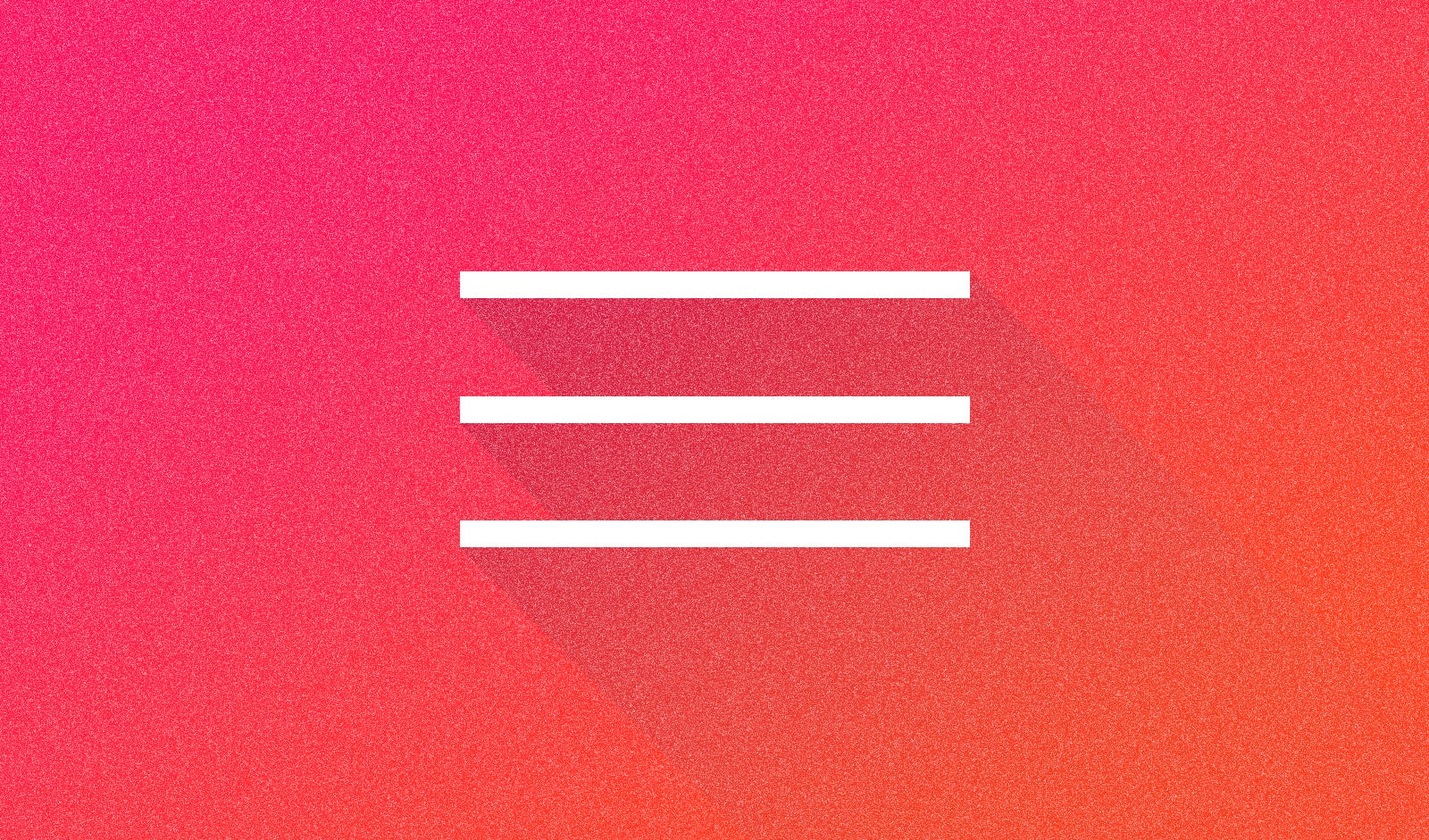
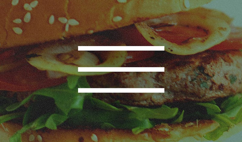
For web and UI/UX designers, this icon is all too familiar: three horizontal lines that stand for a menu. At Mic, we use it to activate a navigational system for users to browse between different content verticals, such as News, Tech and Identities.
But out in the wild, a “hamburger menu,” as it’s called, can signify a wide range of things: a drop-down menu, a column that slides in from the left or a full page modal. In today’s digital age, the hamburger menu is everywhere: desktop site, mobile sites, iOS apps, Android apps. As this UI convention becomes more and more ubiquitous, and comes to stand for more and more functionalities, its usefulness may diminish.
I reached out to Norm Cox, co-founder of Cox & Hall Interaction Design and creator of the hamburger icon. I wanted to see what he thinks about its impact as well as the questions about its usability today: What makes it so prominent? Does it really work? Do people know what it stands for? And do they actually click on it?
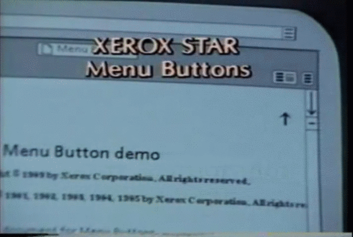
Cox introduced the hamburger menu to the world via the Xerox Star personal workstation in 1981. Many elements of the Star’s UI later made their way into personal computers, from bitmapped displays to file servers, and from icons to email. Back then, the hamburger menu wasn’t known as such. (Thanks, millennials!) “We often referred to it — tongue in cheek — as ‘the air vent to keep the window cool,’” Cox told Sachin Shenolikar. The functionality was simple: Clicking on this small icon in the top-right corner yielded a list of commands.
In a conversation with Xerox.com (parts of which were published here), Cox discussed his thinking behind the icon (Cox shared the full interview with Mic):

“Only two symbols were considered for this button (if I remember correctly). One symbol was a downward pointing arrow in the shape of a triangle, representing the direction that the resulting menu would appear. We decided that this symbol tended to be interpreted too often as a pointer, or directional instruction — like ‘go here,’ or ‘look here.’ The other symbol was the three-line ‘hamburger’ image, representing the look of stacked command buttons. There was never a question as to how many lines, since two lines looked like an ‘equal’ sign, and four lines were visually too many. Three lines were the perfect number. The only other design consideration was whether to have the lines vary in length, to further mimic the varying width of the stacked buttons. We decided that the consistent length lines were less distracting, and more purposeful design.”
In an interview with software designer Geoff Alday, Cox said the hamburger design was “meant to be very ‘road sign’ simple, functionally memorable, and mimic the look of the resulting displayed menu list. With so few pixels to work with, it had to be very distinct, yet simple. I think we only had 16x16 pixels to render the image.”
After debuting on the Xerox Star, the hamburger menu quietly faded for several decades until its reappearance in the late 2000s. With the rise of mobile devices, there was a pressure to fit a large amount of information on a much smaller screen. While it’s still unclear which company adopted this UI element first, many argue that it was Facebook who started with a grid icon and then switched to the hamburger menu. “My guess would be that some UI designer somewhere rendered a symbol with three lines to represent a popup menu,” Cox said in our email conversation, “and wasn’t even aware of its prior existence on the Xerox Star.”
Today the hamburger menu is used everywhere. Every designer knows what type of thing it represents: a menu with more information, options to choose from, a menu with additional features, etc. It’s become popular because it not only saves screen real estate by grouping all secondary and tertiary information together, but also makes the design cleaner and creates space that is pleasing to the eye.
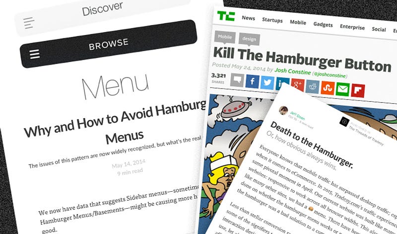
Sounds perfect, right? Not too fast. As visually efficient as the hamburger menu may be, many web designers and product managers find it problematic. What was once a shortcut for users to access additional information is now a curtain that hides content and discourages user interaction. “Essentially, what’s out of sight is out of mind,” Josh Constine wrote at TechCrunch. “Any navigation options you hide behind the hamburger will be forgotten, or at least used a lot less.” As a user, assuming you know what the icon stands for, you must click on it before you can see a list of all the options, which could contain valuable content. Louie Abreu, a UX designer in the U.K., explained in a blog post, “even if people are aware and value a feature, this pattern introduces navigation friction since it forces people to first open the menu and only then allowing them to see and reach their objective.”
“As you might expect, it’s a two-edged sword. As a positive (to some users), it helps to hide clutter and unnecessary actions. As a negative (to some users), it hides actions that they may deem necessary.” — Norm Cox
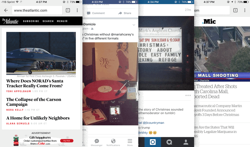
All of a sudden there seems to be a boycott of the label-free hamburger menu. The burger has become the scapegoat for low traffic, lack of usability and weak engagement. Many sites quickly jump on the bandwagon with headlines like “The Hamburger Menu Doesn’t Work” and “Kill The Hamburger Button.” Google, Facebook, Twitter and other companies have abandoned the hamburger menu, replacing it with a different UI or minimizing its prominence on their products.
Tri Vo: Some companies have been using different icons for the same user experience: using a vertical or horizontal set of three dots, adding the word “menu” to the icon, etc. Do you think those attempts are successful?
Norm Cox: “Success” is determined by the tenets of compatibility, usability, effectiveness and efficiency within the context of the application. What may work for one class of user, may not work for another. No symbol will be perfect or intuitive in its early adoptive period. However, with continued use and exposure, it becomes a familiar part of our visual vernacular and improves with time. For example, why are we still using a floppy disk to represent save? Or “scissors”? Or a “clipboard”?
While it is true that the hamburger menu hides content from users, that is the nature of the UX: to hide unnecessary information and create breathing room. As UX designers, we must carefully consider if this particular UX is suitable for our product and our user. While therego’s been a movement to replace the hamburger icon with a three-dot icon, the decision ultimately depends on a product’s own aesthetic and usability needs.
But any icon will still hide content from users. This raises the question of which content we want to hide from users, if any at all.
“It is simply another widget in a designer’s toolbox,” Cox told me. “Its suitability within an interface — whether mobile or desktop — is a result of a well-thought-out and comprehensive UI design. Whether or not it’s an appropriate tool is a judgment call from the UI designer in the context of its application.”
The real problem isn’t the hamburger icon itself. It is the lack of research, understanding design principles and user testings. Implementing the hamburger icon or avoiding it because these articles tell you so is an immature decision and irresponsible design. They say a bad workman always blame his tools. Well, let’s not be that guy.
TV: I think when something is popular, people either go along with it or try to fight it. What are your advices for the designers who are using the hamburger menu because everyone is doing it, and the designers who want to challenge it, also because everyone is doing it?
NC: My advice is to arm yourselves with deep working knowledge of the arts and sciences of UI design, and not be swayed by design fads and uneducated opinions. Every design decision is measurably more effective when filtered through the heuristics, principles and guidelines of visual communication design, cognitive sciences, psychology, human factors, journalism, computer sciences, anthropologies, etc. Good design is about good solutions. The more your design can be evaluated, tested and iterated through the lens of scholarship, the more timeless it becomes.
