

本文已经翻译成中文《我是如何为 Mac 应用 Flinto 设计 UI 图标的》,欢迎参加「掘金翻译计划」,翻译优质的技术文章。
The Flinto team recently interviewed me about the design process behind producing all of the icons for Flinto’s user interface:
How did you contribute to Flinto for Mac?
I worked with Flinto in the months leading up to the release of their new powerful Mac app, and contributed to various parts of the user interface and experience. But because Flinto is a very specialized tool, the more we thought through each part of the user experience the more we realized that the app was going to require a ton of custom icons. Nearly every part of the interface, from the Layers List, to the Toolbar, to the Transition Designer, to the Gestures dropdown was going to require its own set of icons. So that quickly became my main job!
What is your strategy when designing elements like icons or menus inside of a bigger app?
Design is always driven by context. Surprisingly, I found that designing for a professional Mac app was one of the most complex contexts to work within. Even just for the icons! Toolbar icons have to be a certain size, and look a certain way. That is different from the appearance of sidebar icons, which is different from those you’d find in a dropdown menu. Some icons re-appear in multiple places, at multiple sizes, and in multiple styles. Establishing consistency across all parts of Flinto’s interface meant that every icon had to be especially versatile. No symbols that looked great at one size, or in a certain style, but couldn’t be adapted to others.
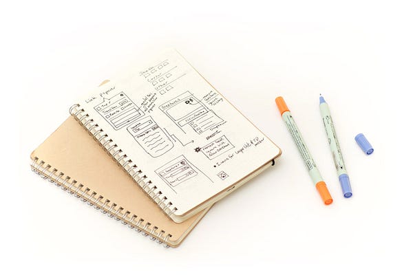
My icon design process begins on paper. I’m a big believer in that. It begins with drawing every imaginable possibility for that icon — what the subject matter or metaphor will be and what variations they could take. While in this conceptual phase, I try to remind myself to put everything down on paper — even random ideas that seem unrelated. The next stage is evaluation; analyzing each concept based on how well it fits the goals, constraints, and context for this particular icon.
I find it essential to separate the drawing & conceptual process from the evaluation process. The former requires imagination, curiosity, and withholding of judgement. It is an additive process. It is spur of the moment. Evaluation — while equally important — requires criticism, pragmatism, and the time to consider a long list of implications. It is a subtractive process. If you try to do both at the same time you will end up with nothing. Your pen will never touch the paper.
I recently taught a class about Icon Design at CreativeLive, and outlined what I think are the most important design principles for icons. Those are what I use to evaluate my ideas and sketches.
Generally only a handful of concepts make their way onto the computer. When I fire up Sketch, it’s production time. There will still be some creative decisions along the way, but the predominant goal is to refine the form of an icon and make sure it is pixel-perfect. I’m really passionate about both of those, but I especially cause a racket when the latter is neglected!
Can you explain a little bit more about pixel perfection, and how to achieve it?
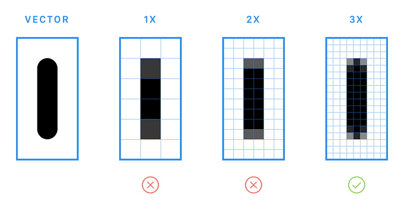
The term pixel perfect can mean a lot of things — it’s more of an ideal than a single concrete characteristic. Like “attention to detail,” it’s easier to identify when it has been ignored! Pixel perfection has a tremendous impact on the recognizability and efficacy of a small icon. And achieving it often requires more than just aligning design elements to the pixel grid (tips below). Basically it’s a fight against antialiasing. Antialiasing is a great thing, but it can produce very fuzzy results — especially for diagonal and curved lines.
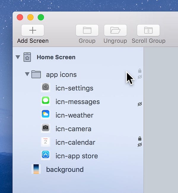
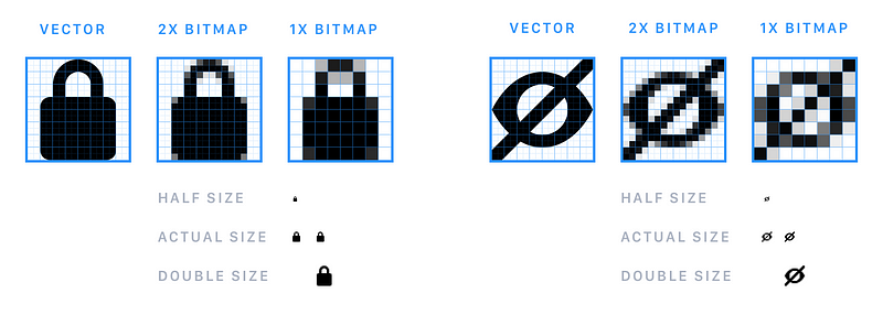
For example, we wanted to include some indication in the Layers List about when a layer is hidden or locked. We weren’t as concerned about them being easily-clickable buttons (although they are) as we were about having small indicators that took up minimal space — especially because two icons would have to be visible if a layer was both hidden and locked. To accomplish this, the icons had to be meticulously pixel-perfect. I’m incredibly proud of how clear those little 8x8 icons turned out.
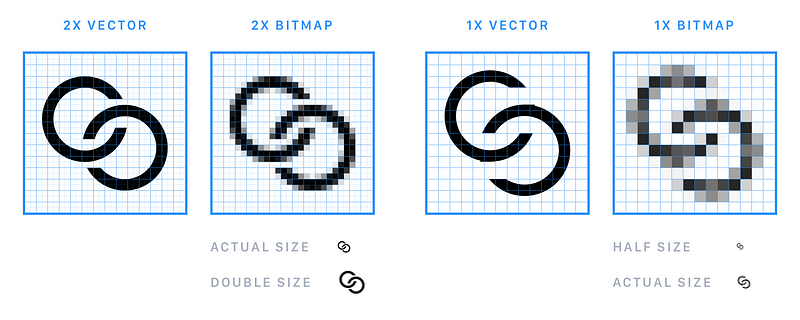
In an ideal world, a well-made vector icon can simply be exported at various pixel-densities and look great at all of those scales. But much of the time, the limitations of designing a 1x asset aren’t worth carrying over to higher pixel densities. You may be able to build an icon perfectly at 2x, but need to make adjustments to create a decent and crisp 1x asset. At least half of the icons in Flinto’s UI have unique 1x and 2x versions, such as the “Connect Layers” icon throughout the Transition Designer.
For anyone who is curious, here are some techniques I used for fine tuning the antialiasing of icons in Flinto:
- Resize and reposition shapes for crisper results, even if that means the position or dimensions have decimals. It’s about appearance, not values.
- Only use curves or rounded corners when there are at least 2px to render each 90° angle of that radius’s circle (see below), or 3px for 180°, as with a rounded ends of a line (below). Goodbye, rounded 1pt line caps — at least until we’re all using 3x screens.
- Adjust border width/thickness to be slightly wider or thinner than 1pt on thin curved or diagonal lines, for a more consistent perceived thickness.
- Mask out unwanted blurry pixels. This will even have an effect if a shape is masked out by a duplicate of itself (no change in shape).
- Duplicate a shape or its border (same position) to be slightly bolder.
- Determine when it’s ok to have a little antialiasing fuzziness because a more important part of the icon benefits. It’s going to be ok!
There are other ways of massaging antialiasing, but these are the techniques I get the most mileage from.
What makes a great icon?
That’s such a loaded question! Especially because icons embody so many design principles in a small package. I actually approached that topic in my icon design class, and used a couple stories from working on Flinto.
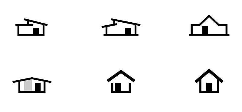
One of them was about using familiar symbols and being obvious. When we started to make the icon for the home screen in Flinto’s Canvas, Nathan had the idea that we could design the icon to be reminiscent of an Eichler home. Eichler was a builder whose “Mid-Century modern” buildings can be seen in neighborhoods all over California.
I think they’re awesome and Nathan was actually in the market to buy one, so we enthusiastically explored the idea. I produced tons of concepts for the home icon, attempting to distill what was uniquely Eichler into a very small square-ish area (ideally 16x16) without relying on color or grayscale (transparency). And we found that these more clever icons didn’t perform their core task as well as the more obvious home icons. We settled on a version that was just slightly expressive and played off the asymmetry in Eichler’s architecture, while remaining obvious and recognizable to users.
Another characteristic of a great icon is how well it harmonizes with its surroundings. That includes UI around the icon, size & weight of adjacent text, operating system conventions, and other icons in that collection.
So whereas the home icon basically exists on its own, the toolbar icons, Gesture icons, and Arrange icons exist in a set. And designing an icon set can be exponentially more challenging. You’ll get half-way through designing a collection of symbols and realize that the style or visual metaphor you’ve been using doesn’t hold up for every required icon, and now everything needs to change! 🙈
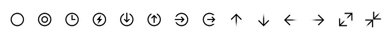
This happened with the Gesture icons (shown here at 200% scale). Their simplicity—which now seems obvious—was born from a long list of constraints and future considerations. Some of the icons shown above aren’t even in the app yet… but it was important to know that the icon set could expand to accommodate them if necessary.
Where can people learn more about all this?
I love this icon stuff, so I recently taught an online class about icon design through CreativeLive. It goes over how to design great icons, build them in Sketch, present them with SVG, and even animate them.
The links and resources from the class are freely available on my website.
If you’re working on a similar project, be sure to check out Apple’s guidelines and specs for various icons in a Mac App.
This interview originally ran on the Flinto Blog.
